Hi,

My name is Zoe Johansen

My passion lies in creating impactful user experiences that align with the goals of a company. I run my own business, helping companies enhance their online brand and strategy through tailored digital solutions.  Currently to elevate my skillset, I am studying UX at CPH Business in the Multimedia Design program, specializing in user-centered design.

Projects
'IKEA' Circular Shop & Green Points in App

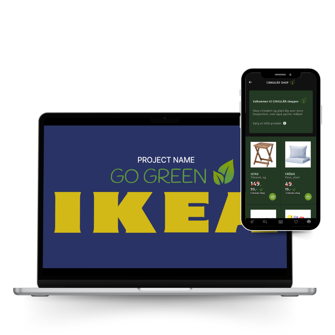
As part of a collaborative team, we designed an interactive prototype for IKEA’s app to enhance customer engagement with their circular initiatives, such as "buy-back" and repair services. Our solution focused on accessibility, ethical design, and intuitive user journeys to support IKEA’s sustainability goals.
'ALLETIDERS KOGEBOG' Website- User Journey Improvement

This project focused on adding targeted features for a specific persona and optimizing the experience to meet their unique needs. Rather than a complete redesign, the enhancements were aimed at improving usability and accessibility for the defined target audience.
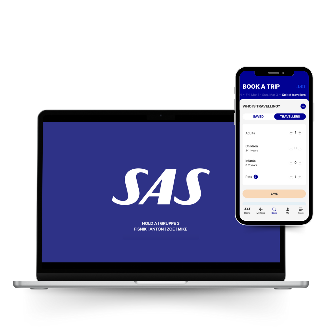
'SAS' Ticket Application - Travel with pet feature

We designed a ticketing app for SAS, focusing on enhancing the travel experience for users like our persona "Amelia Mille", an art director traveling with her dog. Our team utilized user research, feature prioritization, and wireframes to create an intuitive, pet ticket and travel friendly solution.

About Me

I’m a UX design student with a background in online branding, business strategy, and entrepreneurship. With over 5 years of experience running my own businesses, I’ve honed skills in user-centered design, problem-solving, and creating compelling digital experiences. I have a passion for optimizing brands, delivering tailored solutions, and ensuring clear communication between businesses and their target audiences.

I’m driven by curiosity and a desire to continuously improve, always asking how things can be done better. My experience spans branding, marketing, content creation, and web design, which has given me a unique perspective on understanding user needs and creating effective, impactful designs.


Experience

Timeframe 2023-Current

  • Optimizing online user experiences.
  • Enhancing overall business strategy.
  • Web design focused on UX/UI.
  • Custom branding across all platforms.
  • Bridging clients with target audiences.


Timeframe 2020-2023

  • Managed team operations and coordination.
  • Structured weekly schedules for development goals.
  • Tailored our work approach to the
  • children’s specific needs.
  • Communicated and collaborated with parents.
  • Solved problems to ensure progress.


Timeframe 2020-2021

  • Founded and managed a niche clothing brand.
  • Designed and branded the entire business.
  • Utilized trend spotting to stay ahead of customer needs.
    Implemented influencer strategies to boost engagement.
  • Generated all sales via Instagram, leveraging social media.
  • Developed creative, user-centric marketing strategies.
  • Adapted to customer feedback to improve brand offerings.


Timeframe 2018-2021

  • Wrote, designed, and self-published a unique product (oracle cards).
  • Developed a global brand and marketed to 46 countries via Instagram.
  • Leveraged influencer marketing to drive international sales.
  • Applied creative strategies to build a niche product and brand.
  • Managed the end-to-end process from product creation to distribution.


Timeframe 2016-2021

  •  Established and managed a coaching business for 5 years.
  • Developed branding, marketing, and content creation strategies.
  • Designed and maintained a website, ensuring a user-friendly experience.
  • Executed social media marketing campaigns and sales strategies.
  • Facilitated workshops, coordinated events, and created online products.
  • Specialized in graphic design and email marketing for client engagement.


Education

UX / MULTIMEDIA DESIGN - Academy Profession Degree

CPH Business Academy (2023 -June 2025)

COACH CERTIFICATION

Joan Ørting ApS (2017-2018)

Social Educator Profession Bachelor

Copenhagen Professional College (2015 - 2018)

HHX - The Higher Commercial Examination Programme

HHX - International Line, South coast high school - NExt(2009-2011)

Contact Me

Do you have questions?

Contact me via the form or via Likedin or mail.

contact@zoejohansen.com

Copenhagen, Denmark

in/zoe-johansen/

'IKEA' Circular Shop & Green Points in App

Case: IKEA aims to promote sustainability, but their current digital platforms do not fully engage customers with their circular initiatives, such as the "buy-back" program and repair services. The challenge was to design a new concept or redesign their digital solution to make these sustainable options more accessible, ethical, and user-friendly, while adhering to accessibility standards. The goal was to create a functional, interactive prototype that supports both ethical design and improved user engagement in circular activities.

Key acheivements:
We were successful in integrating simple features that aligned with IKEA’s user-friendly app design. We incorperated following new features:

We introduced a "Green Points" program and a "Circular Shop" within the app, enhancing the sustainability focus and providing users with clear options for participating in circular initiatives. On top of that, we also added "Sustainability Information"; Users can easily access information about a product's sustainability, empowering them to make informed purchasing decisions.

My Role: I had hands on all part of the process, during this project executed by me and another team member.

PROCESS

Selection of SDGs

We began by selecting three Sustainable Development Goals (SDGs) to focus on: SDG 12 (Responsible Consumption and Production), SDG 13 (Climate Action), and SDG 15 (Life on Land). These goals aligned with IKEA’s sustainability efforts and our aim to promote responsible practices.

Non-Human Persona

We directed the project towards a non-human persona, "The Forest," representing the ecological impact of IKEA's products. This persona emphasized the importance of sustainability and informed our design decisions to benefit the environment.

Developing Customer Journey Maps

Two customer journey maps were created to visualize interactions with IKEA’s circular initiatives, both when wanting to sell or buy, identifying key touchpoints and opportunities for improvements, especially concerning the "buy-back" program and sustainable goals of IKEA.

Creating a Feature List

Based on insights from the journey map, we compiled a feature list for the app prototype, including easy access to the "buy-back" program, repair service booking, and educational resources on sustainability.

Sketching Low-Fidelity Wireframes

We sketched low-fidelity wireframes to quickly visualize the layout and functionality of the app, focusing on key screens and user interactions. This iterative approach allowed us to refine our ideas before developing high-fidelity designs.

Designing a Flowchart

A flowchart outlined the user experience, ensuring seamless and logical interactions throughout the app.

Building Ethical and Non-Ethical Prototypes

We developed two prototypes in Figma: an ethical version focused on sustainable design principles and a non-ethical version highlighting potential user experience pitfalls.

'ALLETIDERS KOGEBOG' Website- User Journey Improvement

CASE: The task was to redesign the user experience of "Alletiders Kogebog," a Danish recipe-sharing platform. Our goal was to optimize the usability for a specific persona with a focus on features like recipe categorization, user profile management, and voice-activated recipe submissions. The project involved multiple stages, including user research, prototyping, and usability testing.

Key Achievements: We successfully enhanced the user journey for recipe uploads, specifically tailored to our target audience with limited writing abilities. Through prototyping and testing, we identified critical improvements to refine our concept, ensuring a more accessible and user-friendly design before development.

My Role: I had hands on most parts of the project, managing the process and making sure we did not skip over important steps ind the beginning of the process. I did a lot of work on the wireframes and wireflows, to transform our ideas into something tangable, and testable.

PROCESS

Research Phase

During this project, we worked with the persona "Denice," a 40-year-old kitchen assistant who wishes to share recipes in a creative and accessible way despite her challenges with writing.

To manage the project, we developed a project roadmap, outlining each phase of the design process. This included user journey mapping, prototype development, and usability tests, all focused on improving the site's experience for users like Denice.

UX Workshop

For the UX workshop, we began with user research, conducting a short session where we interviewed each other as personas to gather critical observations. This process helped us better understand the user’s needs and frustrations.

Next, we organized these insights into an affinity diagram, grouping them into clear themes.

Afterward, we brainstormed solutions using the HMW (How Might We) method, which allowed us to explore different ways to address the identified issues. Finally, we used dot voting to prioritize which solutions to focus on, resulting in the development of several user stories that guided our design process.

User Journey Map

We outlined the step-by-step process users go through when trying to submit a recipe. We focused on capturing their emotions at each stage, from initial excitement to growing frustration. Users faced challenges navigating the interface, such as confusion about how to create an account and difficulties in submitting their recipe.

The map highlighted key pain points, including the length and complexity of the process, which led to negative emotions like confusion, frustration, and fatigue. This helped us identify areas where the user experience needed improvement, especially in simplifying navigation and reducing barriers to task completion.

Feature List & MoSCOW

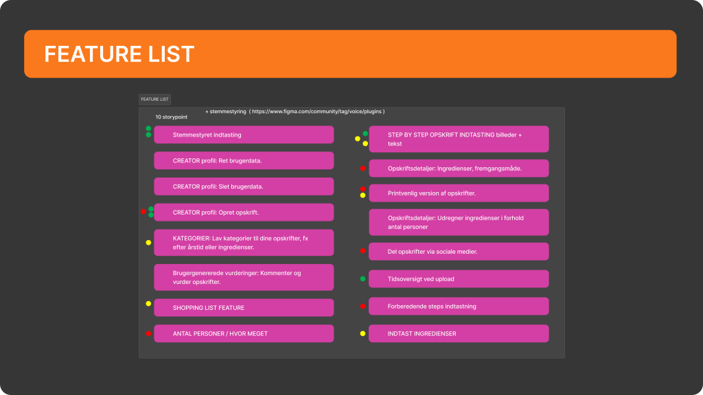
We created a feature list to prioritize functionalities based on user needs and constraints. Key features included voice-controlled input, a step-by-step recipe creation process with images and text, and personalized recipe categories.

To manage time and resources, we employed the MoSCoW method to categorize features into "Must Have", "Should Have", "Could Have", and "Will Not Have". This helped us prioritize the essential features that would provide the most value for the users while keeping within our time and budget constraints.

Sitemap & Card Sorting

We created a sitemap to visualize the structure of the redesigned website. The sitemap ensured a clear and intuitive navigation, with a flat structure for easy access to main features like logging in, searching recipes, and exploring new and popular recipes. Additionally, we included a deeper structure for categories such as "healthy," "seasonal," and "geographical" recipes, offering users more specific options.

We also conducted a card sorting test to understand how users would naturally categorize recipe elements. This helped us refine the category structure by identifying confusion, such as the need for a clearer geographic division and additional categories like baking and condiments. The insights from card sorting were essential in organizing the website's content for an intuitive user experience.

Wireframes / Flowchart / Wireflow

In the design phase of the project, we created wireframes to visualize the structure of key pages like the homepage, user profile, and recipe submission sections. The flowchart was developed to map the entire user journey and interactions, ensuring smooth navigation between different functionalities. Finally, the wireflow connected these wireframes into a cohesive flow, demonstrating how users would move through the interface from one page to another, considering all the actions and transitions needed for a seamless user experience.

Hi-Fi Prototype​

Our high-fidelity prototype for *Alletiders Kogebog* aimed to create a seamless and visually appealing user interface that reflects the functionality and design choices made throughout the project. The prototype features a clean layout with easy navigation between key pages such as the recipe index, user profiles, and the recipe submission process.

One of the main features was the voice-to-text function, which presented challenges due to the limitations of the ProtoPie Genie plugin. Despite these technical difficulties, the prototype successfully demonstrates the core features and interaction flow envisioned for the platform, offering a near-realistic simulation of the final product.

Usability Testing

For the usability tests, we conducted a qualitative study with 5 participants. Each participant was given two tasks: finding a recipe for "vietnamese spring rolls" and creating a new recipe. We observed their actions, noting any difficulties or confusions they encountered, and followed up with interview questions to dive deeper into their experience.

The main focus of the interviews was understanding which steps required extra time and attention, identifying challenges during navigation, and discovering potential improvements. The results helped us refine our prototype, particularly in the areas of navigation, recipe input, and enhancing the overall user experience for the target audience.

Important Findings

The usability tests revealed several important insights.

Firstly, users found it challenging to access categories easily from the homepage, suggesting a need for improved visibility.

Secondly, there was confusion around the category names, and users recommended using icons or images instead of just text to improve clarity.

Thirdly, the placement and design of the "add recipe" icon needs to be reconsidered. Additionally, while it wasn't mandatory to add images for each step of a recipe, users expressed that better guidance on image inclusion would enhance the experience.

Lastly, clearer sub-categories for both browsing and recipe creation were suggested, along with making the ingredient and step addition buttons more prominent during the creation process.

Next Iteration Focus

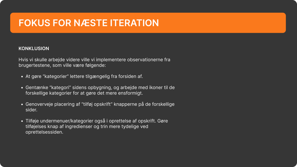
To conclude the project, we identified several focus areas for the next iteration based on user testing feedback. The main areas of improvement include making the "categories" more accessible from the homepage and rethinking the structure of the category page with the use of icons to enhance visual consistency.

Additionally, the placement of the "add recipe" button should be reconsidered to improve user interaction across different pages. We also plan to introduce clearer subcategories for recipe creation and browsing, along with making the ingredient and step addition buttons more prominent during the recipe creation process.

These changes aim to streamline the user experience and address the key challenges observed during testing.

SAS Ticket Application - UX Design

Case: This project concentrated on enhancing the SAS application to cater specifically to travelers like our persona, Amelia Mille, an art director eager to travel with her pet. The primary objective was to design a user-friendly application that facilitates a stress-free journey for pet owners, guiding them seamlessly from the journey planning stage through to arrival.

My Role: I had hands on all aspects of the process.

PROCESS

User insight

Our UX research process involved understanding Amelia's needs, motivations, and pain points as a pet owner. This user insight informed our design decisions, allowing us to integrate essential features such as clear pet travel guidelines, designated pet-friendly zones, and simplified ticket purchasing options.

MoSCoW

By utilizing the MoSCoW prioritization framework, we identified and prioritized features that would significantly enhance the user experience. We developed flowcharts and wireframes to visualize the user journey, ensuring intuitive navigation and accessibility throughout the app.

Flowchart

We began by creating a flowchart to map out the overall user journey, from the initial planning stage to completing a ticket purchase. This high-level overview allowed us to visualize how users would interact with the app, identifying key decision points and ensuring a logical flow through the booking process. The flowchart helped us highlight pain points where users might encounter challenges, allowing us to focus on improving those areas.

Wireframes & Wireflow​

After the flowchart, we developed a wireflow to bridge the gap between interaction design and user flow. The wireflow combined the step-by-step journey with low-fidelity screen sketches, showing how users would move between different app screens. This helped us evaluate the interaction flow and ensured that transitions between stages (e.g., selecting pet-friendly options, confirming tickets) were smooth and intuitive.

Hi-Fi Prototype​

To create the high-fidelity prototype for the SAS ticketing app, we transitioned from our wireframes into a more detailed and polished design using Figma. We incorporated SAS’s brand identity, including color schemes, typography, and visual elements, while refining the user interface for clarity and ease of use. This stage focused on interactivity, allowing us to simulate real user interactions, such as selecting tickets, navigating pet-friendly options, and finalizing purchases. User testing was conducted to validate the design, ensuring it delivered a seamless and engaging experience for pet owners like our persona, Amelia Mille.

Results

The high-fidelity prototype successfully addressed the primary goal of creating a stress-free travel experience for pet owners like Amelia Mille. The app’s intuitive navigation, pet-friendly features, and seamless user flow were well-received during user testing. Users appreciated the clear guidance on traveling with pets and the streamlined ticket purchasing process. By incorporating feedback and aligning the design with SAS’s brand identity, the final prototype provided an engaging and user-centered experience, ultimately enhancing customer satisfaction and meeting SAS’s objectives for pet travelers.

+45 2843 0941

Copenhagen, Denmark

in/zoe-johansen/